Data Stories…Part III “The Mode”
You can have the best data, the best reports tailored for users, but if they can’t get to them how and when they want, the purpose is defeated. To create an effective presentation, you need to consider how the information is viewed. A beautiful dashboard on your laptop is likely unreadable on your tablet or phone. The screen sizes are different and the way you interact is different (e.g. clicks and hovers, vs. taps and gestures). So, we have this third pillar of your data story: The Mode.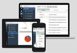
Accommodating “The Mode”
Can we all agree on one thing? If your primary distribution of information is an email blast of spreadsheets, you’re coming up short on all three pillars of your data story. First there’s the email distribution. Nothing like getting your vital corporate data sandwiched between your departmental “Reply to all” email thread with the latest meme or motivational quote. Then, of course, there’s the spreadsheet… And while the issues of the spreadsheet largely fall under the experience, have you ever tried viewing a spreadsheet on your phone? Sort of tough. Think about it, when Excel was invented, few people concerned themselves with the idea of viewing data on a phone! Okay, so we put it on a web page and we’re all good, right? Again, at the dawn of the internet nobody was imagining the handheld devices of today. The disparity in size between that beautiful dashboard on your laptop and the illegible thing on your iPhone is the most obvious example of a difference in mode. While technologies for auto-scaling will improve, there’s no escaping this simple fact: just shrinking something to fit doesn’t necessarily fix the problem.
Size Matters
Screen sizes and ways of interacting with those screens will always be different because there is one constant: the limitations of the human beings interacting with that information. I can view 8pt text on my laptop pretty clearly, but smaller than that, I have issues. I can also view that same 8pt text on my phone. There’s no magic about my phone that allows me to view smaller text. The rub is that those 8pt characters on my phone take up a lot more of the available space than those 8pt characters on my laptop. So, for a dashboard to work on your phone, it must be designed for your phone, and while a little less extreme, the same principals would apply to your tablet.
Behaviors and capabilities like screen rotation are also considerations. Laptops have clicks and hovers. Mobile devices have taps and pinches. While nobody is rotating their laptop, everyone rotates their phones and tablets, and with that behavior comes a certain expectation: that it works! How do you make it work? We prefer to approach the problem by focusing on the commonalities between the modes you need to support. This sort of focus results in simplifying your content, not embellishing it. What’s the benefit of simplification? It’s just easier to read, and isn’t that the point?
The capabilities of Cognos Analytics make it much easier to achieve this optimized design. If you saw our data stories webinar, you would have seen a demo where a custom component in Cognos Analytics resulted in the appropriate layout of our dashboard for mobile or laptop being displayed. By rendering the mode appropriate display, we supported the rest of the desired experience for any persona.
Bringing it all together
Over this series on Data Stories we’ve explored 3 pillars: 1) Define your Personas, 2) understand the desired Experience, and 3) be mindful of the Mode of access. While presented individually, they are intertwined when it comes to the final analytics presentation. If you are looking for success, all three matters must be addressed. If you do that, create an analytics presentation which is geared towards an individual, with an experience, which guides them through the flow of information, on the device of their choice. You just told them “a data story.”