Welcome back to our PAW Pro Tips blog series. In the first blog in this series, we reviewed how to use targeted (asymmetric) selections to hide unwanted data in the PAW cube viewer. In this blog, we’ll look at how to create interactive map visualizations in PAW.
PAW Pro Tip: Interactive Map VisualizationsTo use the map visualization in PAW, we first need to define a geography dimension. This is accomplished by updating the “DIMENSION_TYPE” attribute on the “}Dimensions” dimension. In the example below, I’ve defined the “Entity,” “Store Location,” and “Store Region” dimensions as geography dimensions.
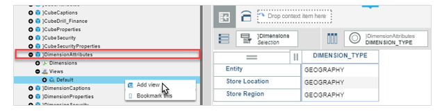
Note that the geography dimension must contain geographical data, such as countries, states, or provinces. To determine if a dimension is valid, PAW analyzes a sample of 2,000 values in the geography dimension column, looking for recognizable place names. If 80% or more of the members in the geography dimension are recognized, a map is generated.
Once we have defined our geography dimension, we can create our map visualization in PAW. We’ll configure our view with the Store Location in the rows. Because the Store Location dimension is a defined geography dimension, the Map visualization is now available.
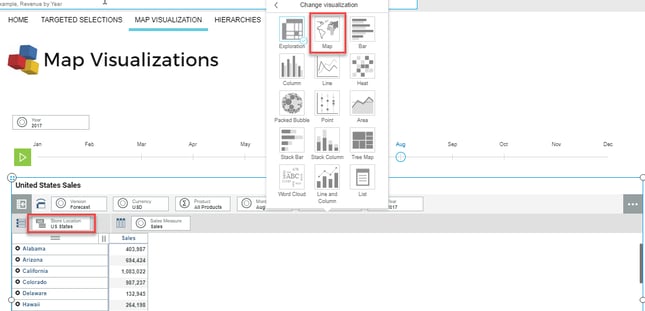
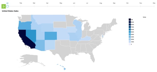
After selecting the map visualization, we can move the measure dimension up to the title area and our map is complete:
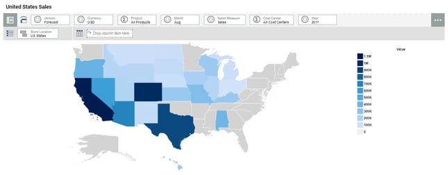
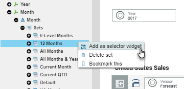
As with most PAW visualizations, users can click on color-coded areas to see values and drill down to more detail. In addition, dimensions can be synchronized with selections in other PAW objects in the same sheet or book. To make this map a little more interactive, we’ll add a slider for the Month to the workspace.
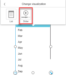
To add a slider to the workspace, we’ll right-click the desired subset in the content tree and select “Add selector as widget.”
Next, we’ll click the widget and then click the “Change visualization” icon, where we’ll select the “Slider” option.
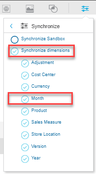
Finally, we’ll select our map visualization and then click the properties icon in the upper-right corner of the workspace and ensure that the Month dimension is synchronized with other widgets on the sheet.
Users can either click the green Play button to automatically cycle through the months or click and move the circular indicator to the desired month.
To learn more about how to use PAW like a pro, please join us for our upcoming PAW Pro Tips webinar on December 14th, and stay tuned for more tips in this blog series!