Learn how to enhance your charting cabilities to include stacked bar charts, mekko charts, bubble charts and more.
Building Meaningful Visualizations
It is often difficult to understand the story that a particular set of data is telling without a meaningful visualization. You can examine the numbers, but without plotting a trendline or a histogram, it is almost impossible to extract actionable intelligence from them.
With IBM’s Cognos Disclosure Management (CDM), native Excel functionality is the user’s toolbox for creating these data visualizations. However, despite there being a breadth of options at the user’s disposal, some of the more complex visualizations are quite difficult to create in Excel. This may include things like stacked bar charts, mekko charts, bubble charts, among others.
Luckily, there is a tool that can be leveraged in tandem with CDM that tremendously simplifies how these visualizations are created. This tool is called ThinkCell.
What is ThinkCell?
ThinkCell is a packaged Excel and PowerPoint Add-In that enables users to simply select which data visualization they want, and it is created automatically along with the underlying data structure. Then, the user would simply populate the ThinkCell data range via Excel formulas or cell references, after which the generated visualization is automatically updated.
ThinkCell then allows for the ability to customize formats, labels, colors, and even add additional information such as a compound growth arrows, total difference arrows, value lines, and more. When integrated with CDM, the Excel data ranges can actually be within Excel Report Objects. Despite being two independently developed products, they work very well together!
Below is a step-by-step example that illustrates some of the things that can be accomplished using CDM and ThinkCell.
We’ll start with a simple data query that has quarterly revenue data by product line. Using this, we’ll create a stacked bar chart, and include an arrow that displays our quarter over quarter change.
Illustration of What can be Done Using CDM and ThinkCell

To begin, we’ll highlight a range in an existing sheet of our Excel Report Object, and navigate to the ThinkCell Group located under the Insert Tab, and select Charts>Stacked.
Highlighting a Range of Excel Report Object
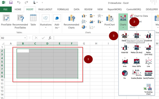
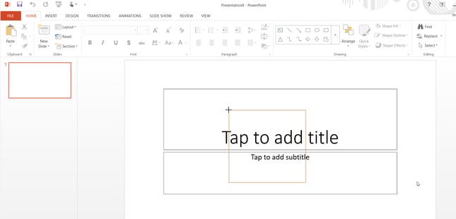
This opens up a new instance of PowerPoint to add the chart.
Adding a New Instance of PowerPoint to the Chart
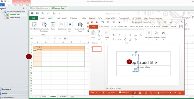
When a chart is inserted, it initially displays as blank until data is entered. The data in the linked data range (indicated by being outlined in green and highlighted in orange) can be updated using cell references to the Database tab where the queried data was pulled.
Cell References to the Database Tab
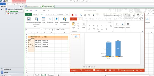
After updating the data and refreshing the chart in the PowerPoint now reflects the latest data entered
PowerPoint Chart Reflecting Latest Data Entered
The default chart settings don’t allow for an easily readable graph. These can be updated using by right-clicking anywhere in the chart, and selecting from the various options. The “wheel” of options is displayed upon the right-click.
Wheel of Options
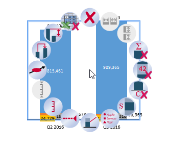
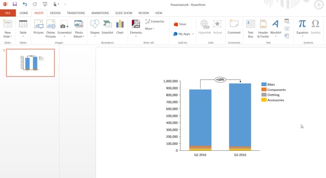
By hovering over each option, a Tooltip is displayed as to what each will actually do. By adding a legend, a y-axis, and total difference arrow, and by removing segment and total labels, the chart now is much more readable.
Visualization of a Much More Readable Chart
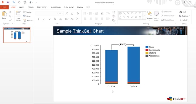
The ThinkCell chart can even adapt to slide themes being applied via the slide master.
Adapting Slide Themes Applied via Slide Master
After being saved, the chart within the PowerPoint instance can now be imported as its own CDM report object, and all of the native CDM functionality can be added on top of it.
Adding CDM Functionality to the Chart
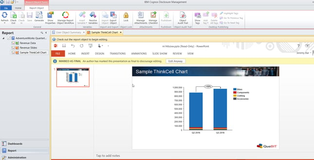
As you can see, rather than spending hours figuring out how to build a chart like this in Excel, it can be done in just a few steps with ThinkCell! As such, exploring the possibility of integrating ThinkCell with CDM may be a worthwhile effort at your organization.
Want to know more about IBM’s Cognos Disclosure Management (CDM)? Register Now for our upcoming CDM webinar!
Visit quebit.com/cdm or email us at info@quebit.com.