You may have heard about Planning Analytics Workspace (PAW), the “new” web-based interface for IBM Planning Analytics (PA). PAW is only available on PA 2.0 or greater – if you are still on TM1 10.2 or prior, we hope you consider upgrading and getting access both PAW and the new Excel add-in, Planning Analytics for Excel (stay tuned for an upcoming blog on this!).
The workspace is a major improvement in the user experience, bringing together familiar crosstabs,  attractive visualizations, published Excel reports, and even tools for developers and administrators, such as rule and TurboIntegrator editors, dimension and hierarchy editors, and migration tools – all in one place!
PAW also introduces new functionality and awesome new features that are not available in Perspectives or TM1Web, and these come with a bit of a learning curve. The new hierarchy functionality opens a lot of possibility for new ways of analyzing data, but also brings new considerations for model development and maintenance.
In this blog series, we’ll share some tips and tricks to help you start using PAW like a pro! In this first blog, we’ll show you how to use targeted (asymmetric) selections to hide unwanted data in the PAW cube viewer.
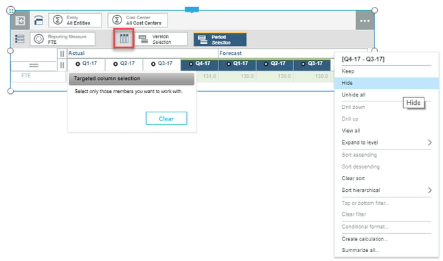
PAW Pro Tip: Using Targeted (Asymmetric) SelectionsThis is a super cool PAW feature that is not possible in the cube viewer using Perspectives or TM1Web, and previously could only be accomplished in an Excel report. So, what are targeted selections? Let's say we have the view below and we want to just show Q1-17 through Q3-17 Actual and Q4-17 Forecast only:

The trick is to click the "Targeted column selection" icon, select the unwanted columns, and click "Hide."

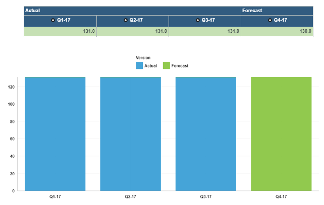
Voila! The unwanted columns have been removed from the view.

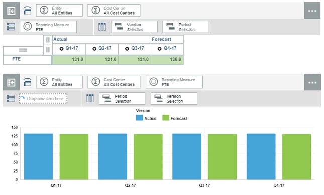
Note that this feature does not work with any visualizations besides the crosstab. In the screenshot below, both Actual and Forecast data are shown for all Periods in the Column visualization.

There are several workarounds that can be employed to hide the unwanted data in a chart visualization, such as using rules to set Forecast periods to 0 or create “Blended Forecast” versions, or utilizing the PAW hierarchy functionality to separate periods into “Actual” and “Forecast” hierarchies.

To learn more about how to use PAW like a pro, please join us for our upcoming PAW Pro Tips webinar on December 14th, and stay tuned for the following upcoming blogs in the PAW Pro Tips series:
- Interactive Map Visualizations
- Creating User-Defined Calculations
- Using PAW Hierarchies
- Intro to Planning Analytics for Excel (PAx)
Want to know more? Register Now for our upcoming webinar: Do you want to use Planning Analytics Workspace (PAW) like a pro?