I am not a Finance guy, but as a Product Manager at QueBIT, I am part of a team that spends equal if not more time fretting over and fine-tuning User Experience (UX) than building new functionality into our software offerings. One of the things that I’ve found revealing in my years at QueBIT is how the same is true in Finance and how crucial the UX is to some of our customers. Conveying financial information in a way that is visually engaging, tells a story and drives meaningful action, requires empathy, a good “eye” and a bit of fine art.
While UX is routinely used to describe how users interact with a software product, it actually applies to the design and presentation of anything that a person interacts with. Ask yourself, how do I want my audience to react to my work? For example, the UX of unboxing a new purchase reflects the care taken to produce the precious item contained inside the packaging. Even though the packaging itself is destined for the waste bin, the customer is left with the impression that this company really takes pride in their work. Why shouldn’t the same principles apply to financial and performance management information shared across an organization?
Let’s consider that old staple, the Board Book. The Board Book is typically a monthly collection of miscellaneous financial reports and Key Performance Indicators (KPIs) intended to convey to board members and executive managers the salient information they need to inform their decisions on strategy, capital allocation, performance measurement, and risk management. While much of this information is quantitative, qualitative statements are also included to provide insights and context. As any financial analyst who has worked on producing Board Books knows, it is very important to present the information in a way that is meaningful to this specific audience. While a Chief Financial Officer (CFO) with a finance and accounting background may be perfectly happy scrolling through grids of numbers, the broader Board Book audience usually prefers more charts and graphs. This explains why PowerPoint slide decks, with their many options to add visual appeal, have become the preferred medium for Board Book presentations.
There are already plenty of fantastic articles on building effective presentations. We won’t look to summarize those here, except to call out that they’re applicable and worthy of your time. The challenge we want to focus on is how can we leverage automation and mechanize the building of these presentations each month, to minimize the risk of error and win back time, without having to become a programmer?
Microsoft allows us to embed or link Excel spreadsheet objects directly into PowerPoint to make it quicker for us to update information in source files and watch the changes reflected in our presentations automatically. If we embed entire Excel files in the presentations, we have the benefit of everything being encapsulated in a single package, but there is a disadvantage if the Excel files contain detailed information that is not intended for our audience.
Alternatively, we can link to data in external Excel files. The benefit here is that we can carefully select what appears in the PowerPoint presentation, but we must be careful not to rename or move files around in ways the break these links or we’ve just created a new type of work for ourselves.
Regardless, either of these options is a good first step and can certainly help make presentation production smoother.
But there is always more to be done. Using embedding or linking are decent options for a chart or a table of data, but what about commentary, conditional formatting, or screenshots of key data ranges? We’ve barely covered half the work.
There are countless techniques we can employ using only existing Excel skillsets to ready the information to be brought to PowerPoint. For example, Excel’s TEXT formula makes it easy to format numbers and IF formulas can be used for adjusting terms like “short of” or “favorable to” based on value signs. INDEX and MATCH enable advanced lookups that make it possible for us to inspect data to find things like the top performer or largest change. To keep all these formulas manageable, we can work across a range of cells and then use Excel’s CONCAT to combine the entire range into a single sentence. Using these formulas allows us to essentially program the quantifiable commentary in our presentations without learning yet another tool. Review the source Excel file below the screenshot to see how we’ve automated the insights on this slide using just Excel formulas.
At QueBIT we followed our customers to learn how finance users can automate as much of the presentation development as possible and transcend Microsoft’s limitations. For them this meant allowing them to work in Excel and essentially driving the development of the PowerPoint presentation based on native Excel features.
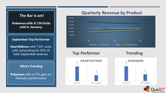
The example slide to the right presents several key points, all of which were sourced from an Excel file in an automated fashion. First there’s a small screenshot of the high-level finances. A screenshot was chosen because it’s a mix of cell values, conditional formats and borders. Next, there is some commentary. Each line of the commentary is essentially the explained sentence form of the same numbers but with percentages and comparisons as opposed to actual values. One of the lines of commentary highlights the primary driver, which is simply finding the product with the highest percentage-of-sales and focusing on that item. Finally, there’s a chart that shows the performance of that same primary driver product. While there are four charts in our Excel file, we only want to include this specific one in our PowerPoint and it may change from month to month.
As a Product Manager, I was stunned to see the complex Excel programming that some of our customers had already invested in these areas. Trusted, validated data from Planning Systems that integrate into Excel are pulled automatically into pre-formatted spreadsheet templates. Once there, all Excel’s functionality can be used to turn those numbers into visualizations and insights. These in turn can be strategically brought into PowerPoint and formatted to provide the optimal User Experience, so that the intended audience can easily understand the information and engage with it.
But putting it all together for an end-to-end system means going from close-of-business to Board Book at the push-of-a-button. This is where QueBIT ReportWORQ adds value. With a push-of-a-button, ReportWORQ takes care of (1) updating data in the Excel templates from the Planning System, (2) recalculating the Excel files, and (3) copying the key text, screenshots, and charts into the PowerPoint slides that you have already painstakingly prepared. What previously required a certain amount of file management, data validation and sometimes manual cutting-and-pasting, is now a fully automated process where data flows from Planning System to Excel Formulas to PowerPoint Visualization in just a few seconds. Once the ReportWORQ automation has been configured, next month’s presentation build is just another push of the button!
If you’re interested in learning more about how ReportWORQ automates PowerPoint presentations or hearing about how some of our customers have upped their managerial reporting game feel free to contact me directly at aweiss@quebit.com. Thank you for taking the time to read this article.